

CSS Animation Examples with Source Code | Hex Bricks Loader
Last Updated: 2025-08-16 08:09:01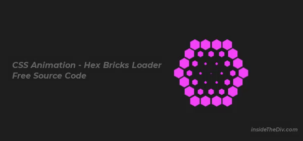
If you’re searching for CSS loader spinner ideas or CSS loading animation examples, this Hex Bricks Loader is a fun and creative project you can build with just HTML and CSS. In this tutorial, we’ll create a pulsing, color-changing hexagon pattern that works perfectly for landing page animation in CSS or any stylish website preloader.
This loader combines CSS hex bricks animation with smooth keyframe effects. It’s one of the best free CSS animation examples with source code, making it easy for beginners to learn and customize. You’ll also understand how to make a loader in CSS without using any JavaScript.
Download the complete source code from here and start experimenting with colors, speed, and layout to match your design style.
You can also try the following project to practice CSS animation.
Source Code Explanation
The animation is built from multiple .brick elements arranged in a hexagonal pattern. Each one contains .hex-brick parts that change color using the @keyframes fade animation and shrink/expand with @keyframes pulse.
We add animation delays to each row (.r1, .r2, .r3) so the effect appears in sequence, creating a flowing CSS loader spinner style. All positions are managed with CSS margin offsets to form the hex bricks design.
.hex-brick {
    background: #ff44f6;
    width: 30px;
    height: 17px;
    position: absolute;
    top: 5px;
    animation-name: fade;
    animation-duration: 2s;
    animation-iteration-count: infinite;
}
.center-div {
    margin-left: -15px;
    margin-top: -15px;
    animation-name: pulse;
    animation-duration: 2s;
    animation-iteration-count: infinite;
}
/* Pulse: scale down to almost zero then back to normal */
@keyframes pulse {
    0% { transform: scale(1); }
    50% { transform: scale(0.01); }
    100% { transform: scale(1); }
}

/* Fade: smoothly change between three colors */
@keyframes fade {
    0% { background: #f247f8; }
    50% { background: #ee27f5; }
    100% { background: #ef13f7; }
}
Final Suggestions
- To create this CSS loader examples with source code:
- Use
@keyframesfor both pulsing and color changes. - Apply animation delays to create a wave effect.
- Position bricks precisely for the hexagonal shape.
- Experiment with gradient or solid colors for variety.
- Watch the video tutorial for a full step-by-step guide.
With this approach, you can easily create a loader in CSS for websites, apps, or landing pages.
Still you face problems, feel free to contact with me, I will try my best to help you.