

CSS Animation Example with Source Code | Pill Loader
Last Updated: 2025-08-21 21:15:15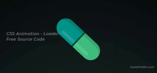
Are you looking to create an eye-catching CSS loader spinner or a unique css loading animation for your website? In this blog, we’ll showcase a cool pill loader animation with full source code. This example is perfect if you want to learn how to make a loader in CSS or want to explore css animation examples with source code to improve your frontend skills.
You’ll also get a chance to download the source code and try it yourself. Whether you want to build simple or advanced loading animations CSS, this example will help you understand key CSS animation techniques.
You can also try the following project to practice CSS animation.
Overview: Pill Loader Animation
- How to create a loader in CSS with smooth, rotating pill animation
- Use of keyframes for css loading animation and shine effects
- How to implement floating particles inside the loader using CSS
- Inspiration from css hex bricks animation and hex bricks design styles
- Tips on using a css loader generator for quick animations
- Examples of free css animation examples with source code for practice
- Using this loader in your landing page animation in CSS
You can download the full source code here and start experimenting right away.
How This Animation Works
Here are the key parts of the pill loader’s CSS:
/* Shine animation */
@keyframes shine {
	0%, 46% { right: 1.5vmin; }
	54%, 100% { right: 7.5vmin; }
}

/* Shadow flip animation */
@keyframes shadow {
	0%, 49.999% { transform: rotateY(0deg); left: 0; }
	50%, 100% { transform: rotateY(180deg); left: -3vmin; }
}

/* Floating particle animation */
@keyframes medicine-dust {
	0%, 100% { transform: translate3d(0, 0, -0.1vmin); }
	25% { transform: translate3d(0.25vmin, 5vmin, 0); }
	75% { transform: translate3d(-0.1vmin, -4vmin, 0.25vmin); }
}
- Container Setup: The
.contentcenters the loader on the screen with a radial gradient background. - Pill Animation: The
.pillelement rotates infinitely withspinkeyframes while its halves animate with an opening effect usingopenkeyframes. - Shine & Shadow Effects: Pseudo-elements
:beforeand:afteradd subtle shine and shadow animations to create depth. - Medicine Particles: Small circles (
.medicine i) inside the pill float up and down with themedicine-dustanimation, creating a dynamic effect. - Responsive Units: Using viewport units (vmin) ensures the loader scales well on different screen sizes.
You’ll find the css loader examples with source code downloadable below for hands-on learning.
My Suggestions to Create This Pill Loader Animation
- Use
transformandkeyframeswisely for smooth rotation and open-close animations. - Apply pseudo-elements for realistic shine and shadow effects without extra HTML.
- Experiment with different colors and sizes to customize the css loader spinner to your brand.
- Try adding floating particles with varying sizes and delays to create engaging animations.
- Check out the css loader generator tools online to create custom loaders quickly.
For a better understanding, you can also watch the video tutorial linked with the source code to see every step in action.
Still you face problems, feel free to contact with me, I will try my best to help you.